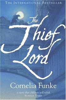
1.
2.
3.
4.
5. French Edition
6. Italian Edition
7. German Edition
8. Movie Cover (German Edition)
In #1, I like how all the colors are muted, and I really like the red text for the title. I would like it a bit better if the text didn't touch the buildings on the right side, but the bridge isn't exactly centered, so it would be uneven no matter what. I really like the picture (the same image is used for covers 1-3); it's my favorite image of all the covers. It has both the soft lyricality (I think I just made up a word) of the writing and the mystery of the plot. There's also something about the colors on this cover that I can't quite put my finger on that keeps drawing me in. Overall, this cover was very well done.
#2 is the (much loved) copy I have at home. On my copy (but not on the picture I found to post) both the title and the author's name are embossed, and the top says "The Enchanting International Bestseller". On this cover, I like that the image is all in shades of blue except the moon and the title. It highlights the title in a way that the first cover doesn't. I also really like the font of the title and the font and placement of the author's name. I like that there is no quote at the bottom of this cover, although in #1, the bottom would have been a little bit empty without it.
I think #3 would look good on a hardcover, so that it doesn't seem like the letters of the title are about to be cut off the page. I don't love this cover, nor do I strongly dislike it. I don't love that it has only part of the picture, but it does look nice with the text...
#4 is definitely my least favorite cover of the English editions, and I can't decide whether it is my least favorite of all the covers - it's definitely in the running. The silver-embossed letters for the title is certainly eye-catching, but the combination of all the parts of the cover really don't work for me. If I saw this in a bookstore (or online, for that matter), I'd probably put it back on the shelf. This cover just doesn't capture the enchantment and wonder of the book, and to me it even seems a little creepy.
I probably wouldn't pick #5 as the best cover for this book, but I do really like it. It's the most playful of all the covers, and I like that Scipio is running along the rooftops in his mask. It seems like the illustrator for this cover kept "kid's book" firmly in his or her mind when illustrating it, because more than any of the others, this cover looks like it's for kids. I really like the font combined with the picture, and how it incorporates a lot of things from the story. It's got the five kids and Scipio, and the winged lion on the bridge, and of the covers, it's most obviously set in Venice (to me anyway). Although not my top choice, this is definitely one of my favorites.
#6 is on the lower end of my list. Especially compared to the playfulness of the French edition right before it, this cover seems a little bland. It doesn't make me want to pick it up and say, ooh, what's this about? The winged lion is cool, but overall I don't love the cover.
I like #7, but I feel like the illustrator or graphic designer or whoever could have done a lot more with it. I like the picture (although not as much as the picture from the first few covers), and I think the illustrator did a great job with Scipio. And I like how the color of the text matches the roofs. But the text seems a little too plain to me. I think they could have done something really cool with it, but settled for plain old (is that Times New Roman? I think it is). On a side note, I really like how the title translates to Gentleman of the Thieves. The German edition gets bonus points for that.
And now #8, the last cover. As you will find as judge more books by their covers or if you've ever been in a bookstore with me, I *ahem* strongly dislike movie covers. They drive me nuts. They drive my especially nuts if I think that movie wasn't even that great. That is the case for this cover. Putting that aside, I do like the title. Um.... I can't seem to find anything else especially good about it. Also, before I put it in the translator, I thought the red stripe at the bottom said something like, "Now a Major Motion Picture" like the ones in the United States. I almost laughed out loud when I found out it meant "extra charge with film pictures". For goodness sakes.
My favorite: #1.
#2 was very close behind, but I really do like the coloring on the first one. Honorary mention to #5 as well.
[EDIT: I changed my mind. #2 is tied with #1 for first.]
My least favorite: #8, by a long shot.
What's your favorite?


3 comments:
Number 2 is the best. The font beats number 1. Number 8 is just awful. Number 7 I would like if not for the mask. Number 5 I would like if not for the ludicrous position of the thief.
I do like the font on No.2 best, but the coloring for No.1 is just so great... it was very close. Also, Scipio on the roofs in No.5 made me laugh. I like it.
I appreciate how each cover captures a different aspect of The Thief Lord.
Post a Comment